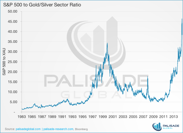

CRAZY: Gold/Silver Index (XAU) to S&P 500 Ratio
Fantastic chart from the Palisade research team showing the ratio between the S&P 500 and the gold/silver sector (XAU). As you can see when you click on the chart, never before has the ratio been so skewed in favor of the S&P 500. What does this mean to me? It means the gold and silver sector has a lot of appreciating and catching up to do. A lot! Bullish for gold and silver. The guys at Palisade have 4 more interesting gold and silver charts that you should probably check out. See them at the link/picture below.
Five Charts Showing Why Gold Stocks Have Never Been This Cheap! – 1 Year Later

